Animated CSS gradient with mask-image
Upcoming
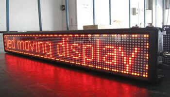
One day I was asked to tweak the so called upcoming element. The upcoming element is something like a scrolling text board (or moving display) but created in HTML and CSS. When the text contained in the upcoming container is too long, it is moved from right to left.
Moving display
It is rather easy to do with HTML and CSS. There is a wrapper with overflow-x: hidden and text inside with white-space: nowrap. Scrolling is enabled with CSS or JavaScript. In this case JavaScript is used for two reasons: first to check if the text is longer than the wrapper (and its width can change, of course) so it also allows you to decide how far the text should move; and second to keep a constant scrolling speed.
The simplified code looks like this
<div class="upcoming-element">
    <p>Upcoming:</p>
    <div class="marqueeable">
        <h3>Watch this new video! Watch this new video! Watch this new video!</h3>
    </div>
</div>

<!-- Used to measure width of h3 title -->
<h3 class="measure"></h3>
.upcoming-element {
    width: 450px;
    position: relative;
    background-color: #00CCFF;
    margin-bottom: 25px;
    opacity: 0.75;
}
.marqueeable {
    overflow-x: hidden;
    width: 450px;
    position: relative;
    opacity: 0.75;
}
h3.measure {
    display: none;
    padding: 0 10px;
}
var scrollHandler = function (evt) {
    $('.measure').text($('.marqueeable > h3').text());

    var marqueeSpeed = 55; // px per s
    var marqueeWidth = $('.measure').outerWidth() - $('.marqueeable').width();
    var marqueeDuration = Math.round(marqueeWidth / marqueeSpeed * 1000);

    if (marqueeWidth > 0) {
        $('.marqueeable h3').animate({
            "margin-left": "-=" + marqueeWidth
        }, marqueeDuration, function () {
            $('.marqueeable h3').css('margin-left', 0);
        });
    }
}
Here is the whole working example: Marqueeable example on jsfiddle
Easy, huh?
It works fine, but it could look better. So the idea was to add some fading shadows/opacity to the edges of text when it is outside of the wrapper. We tried several things, and the best one was linear-gradient with the mask-image CSS property (well, it only works in chrome for now, but that’s enough). You can apply the mask directly to the text, but when it is moving the mask disappears under the wrapper (it appears that the text element is moving) so the mask needs to be applied on the wrapper. Of course the mask should be only visible when text overflows the wrapper.
.marqueeable.mask {
    -webkit-mask-image: -webkit-linear-gradient(right, rgba(0,0,0,0) 0, rgba(0,0,0,1) 150px);
}
Show mask when scrolling starts, remove when ends
if (marqueeWidth > 0) {
    $('.marqueeable').addClass('mask');
    $('.marqueeable h3').animate({
        "margin-left": "-=" + marqueeWidth
    }, marqueeDuration, function () {
        $('.marqueeable h3').css('margin-left', 0);
        $('.marqueeable').removeClass('mask');
    });
}
Working example with mask (for simplicity, in this example the mask is only on the right end of the wrapper).
Mask me like one of your French girls
The last thing to do was to make the mask fade in/out, not just show/hide. It looks much better and smoother. The first idea was to use a CSS transition - that’s the modern way to do it. But there was a problem: mask-image and linear-gradient do not support transitions yet (as far as I know - stackoverflow told me so: CSS transition with linear gradient, Use CSS3 transitions with gradient backgrounds, jsfiddle test).
One suggestion on stackoverflow was just to fade the container that contains the gradient. But our container contains the text, so by fading it out, the text will also disappear. Using a container over the text with position: absolute doesn’t work, because mask-image doesn’t work this way. The container with applied mask needs to be the parent of the element it’s masking (and not with position: absolute). So let’s put another text element under the first one so that when the first (with mask) is fading, the second one is still visible and it looks like only the mask is fading. Of course it should happen also when text is moving. But… will it blend?
It’s a little more complex when there are masks on both sides. When there is only a mask on one end, you just need to duplicate the element once, and there can only be one transition at a time. To have masks on both ends with independent animations, three elements are needed because there can be two transitions happening at the same time, which can’t be achieved with only two elements.
Any thoughts?